About
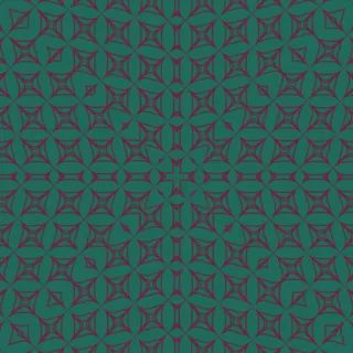
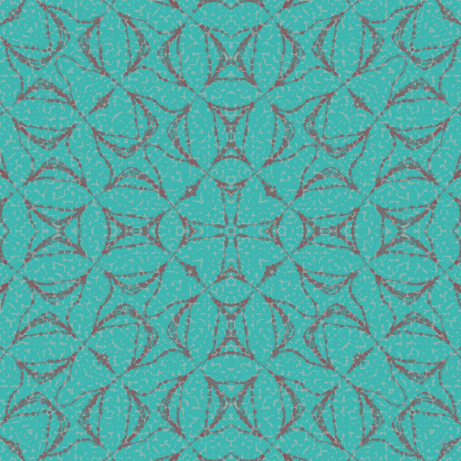
Turquoise ground carries a fine, dotted grey-mauve linework of interlocking arcs, lozenges and four-cornered florets. Motifs sit in staggered rows across the field, with mirrored blossoms and hourglass forms repeating at a regular interval, so the eye reads a steady, rhythmic lattice rather than a single focal shape.
CC0 — use it for anything, no attribution needed. Read the FAQ
Palette
#508f8f#30af8f#50af8f#707070#507070
One tile
Recipe
technique
elliptic field
technique group
noise
wallpaper group
p4m
shape
square
cell count
7
lattice shear
0.24817622043192386
style
pointillism
strength
0.5316810376942158
dot size
×2.6
color preset
infrared
ground
gray board
seed
1503643523